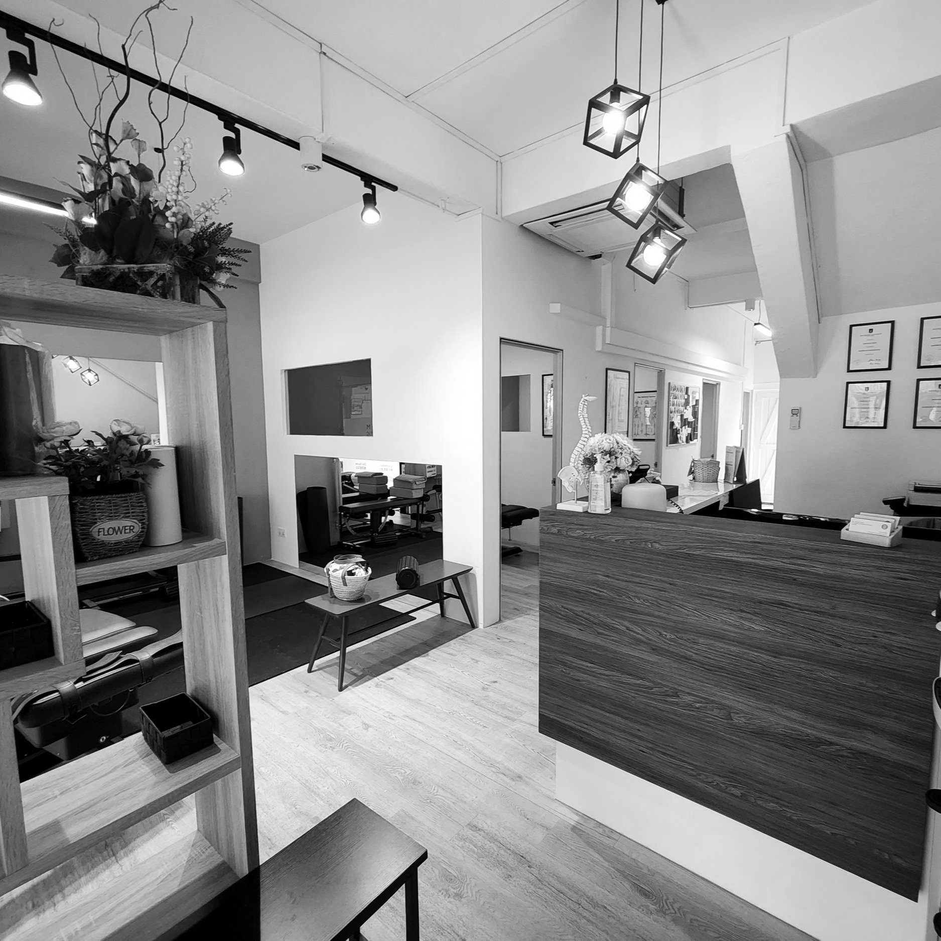
reform chiropractic clinic

Project Area: 800 SF
Project Year: 2022
Location: Singapore, Singapore
Dr. David heads a successful chiro practice situated in the heart of Singapore. However, he realized, given the changing times, he would like to re-design his chiropractic clinic. Mainly to open up the space, accommodating more group sessions whilst retaining the provision to conduct one on one sessions. In addition, he wished to incorporate a small play area for toddlers, a retail display, and modernize the overall look and feel. We chose to follow the simple brand outlook and come up with a minimalist yet functional design. The finishes too reflected the same.
FUNCTIONALITY
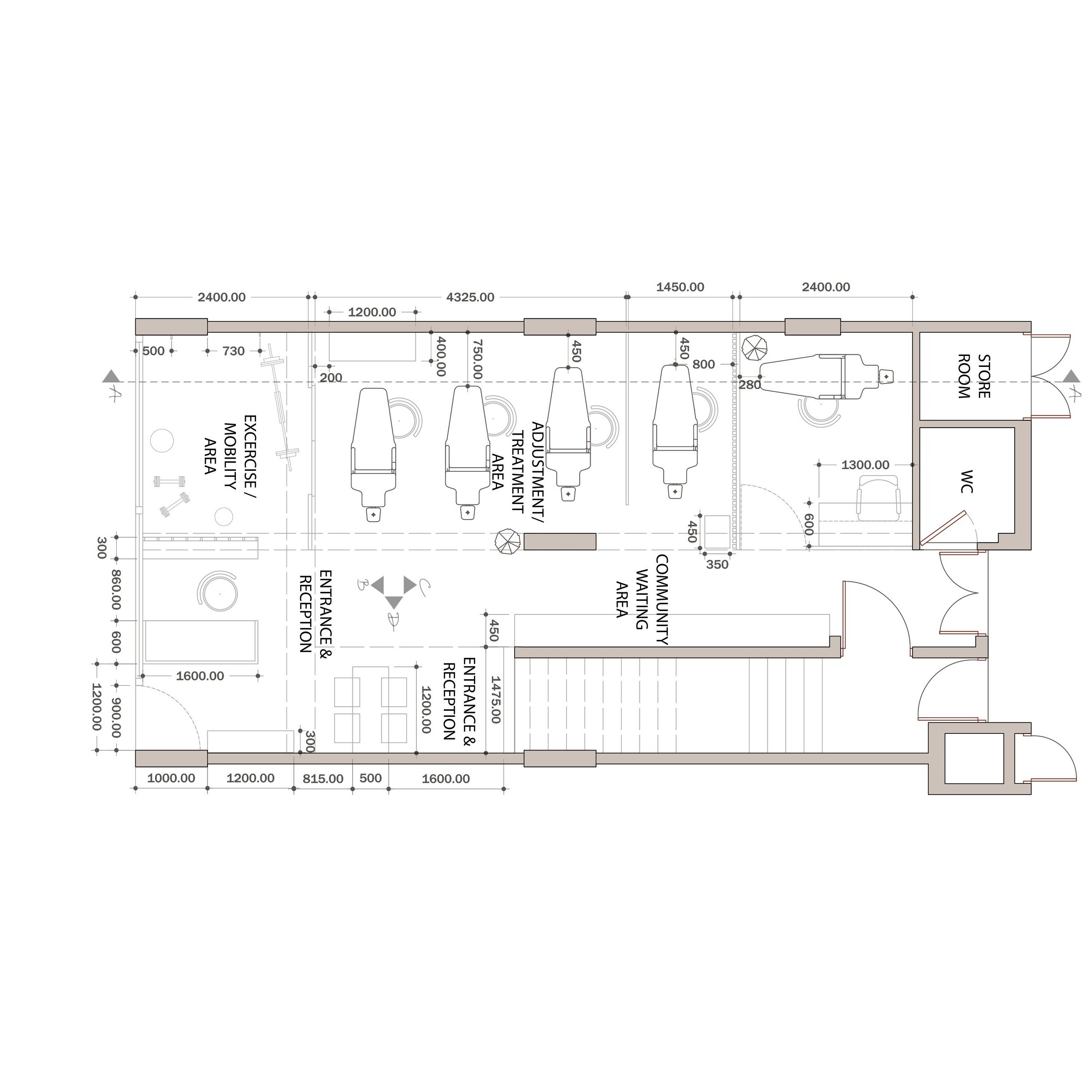
The earlier floor plan lacked definite activity zones with a considerable amount of space wasted. Our main design goal here is to bring in definite segregation for the smooth movement of customers and meet our client’s requirements simultaneously. By eliminating the private consultation rooms, we have an open adjustment/ treatment area as seen in the diagrams below. Different activities within the clinic are outlined with existing structural components creating visual segregation between zones. We added a few elements to further emphasize the zone segregation, physically - such as the sliding partition and reception desk with retail shelves.
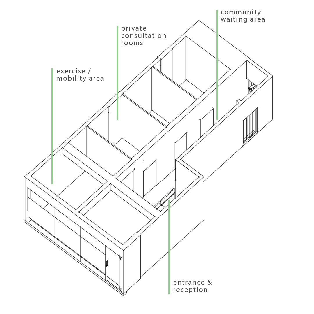
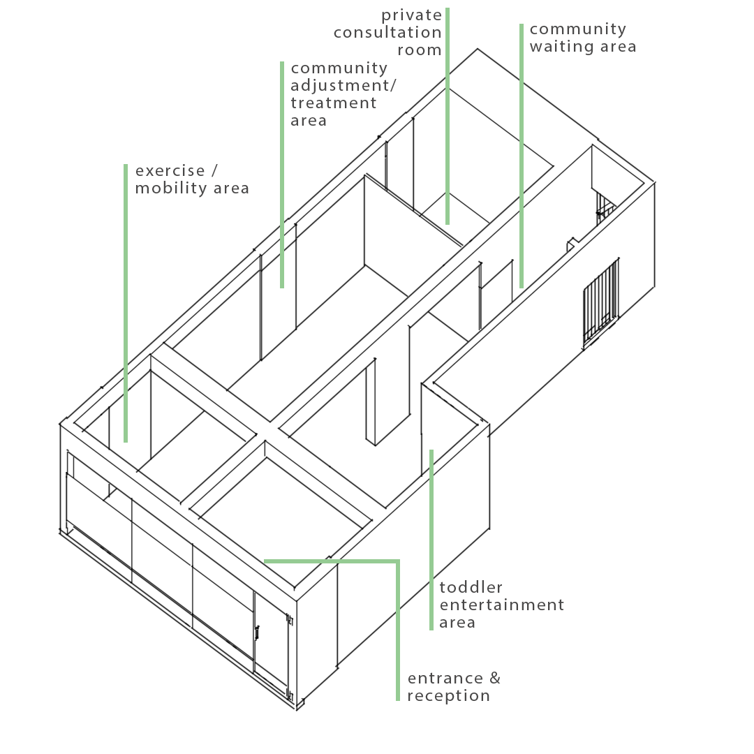
Key Spaces:
Entrance + Reception
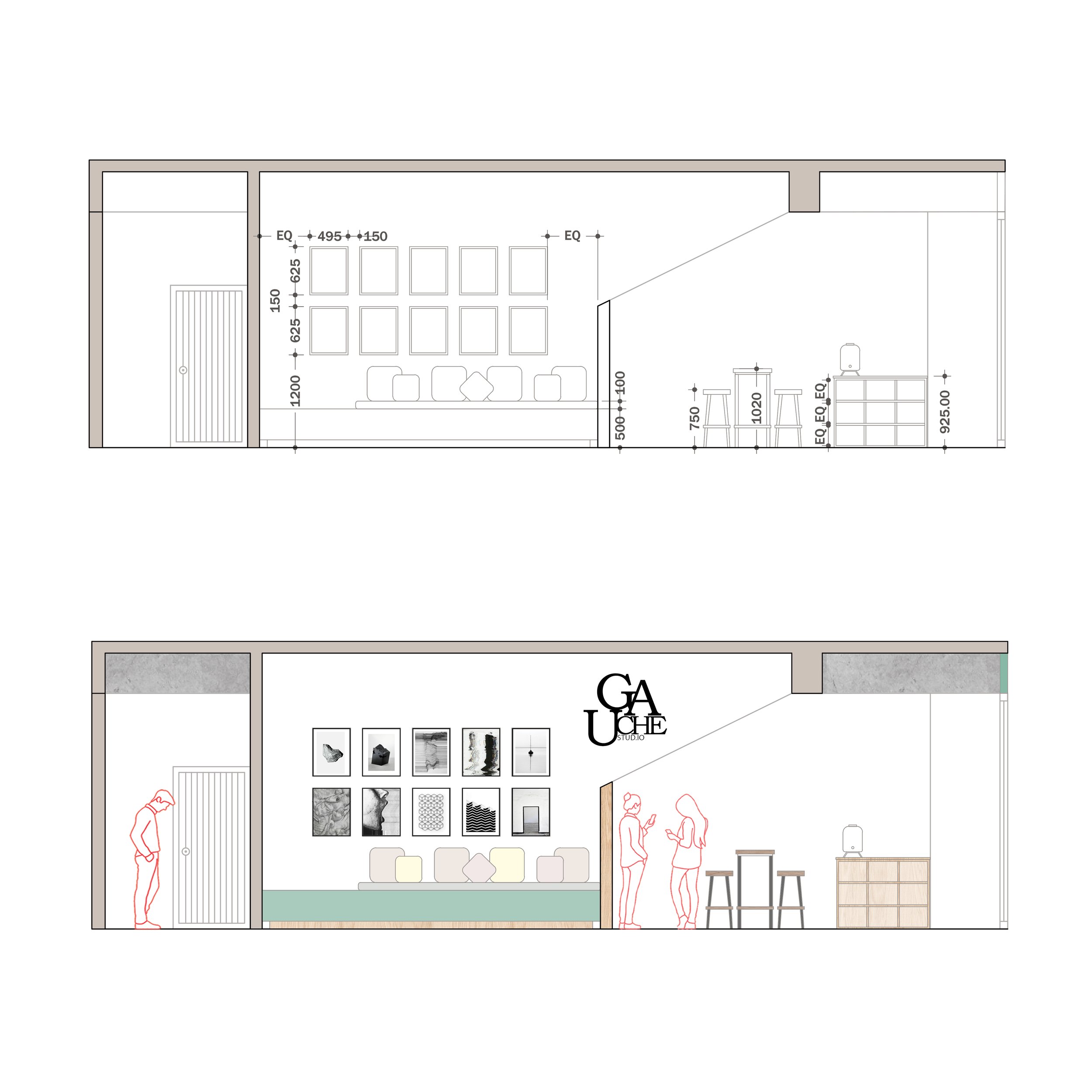
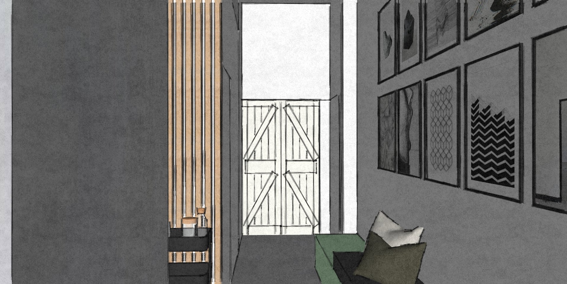
Community Waiting area
Exercise/ Mobility area
Adjustment/Treatment area
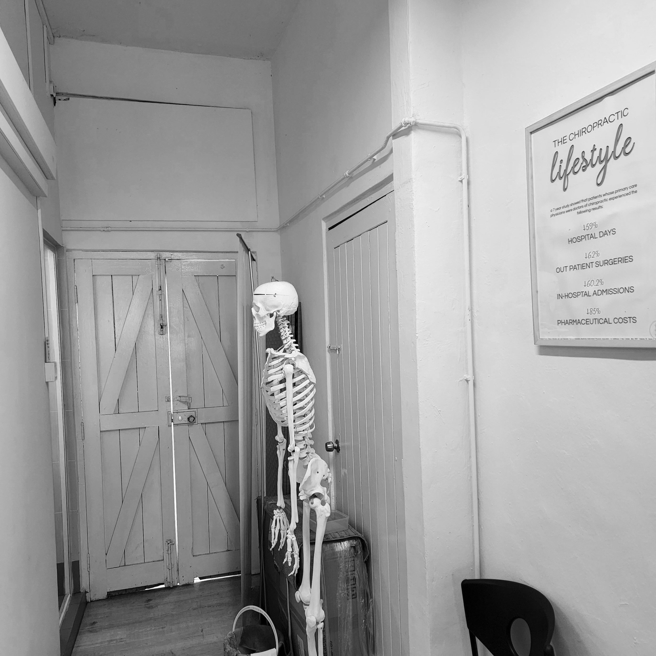
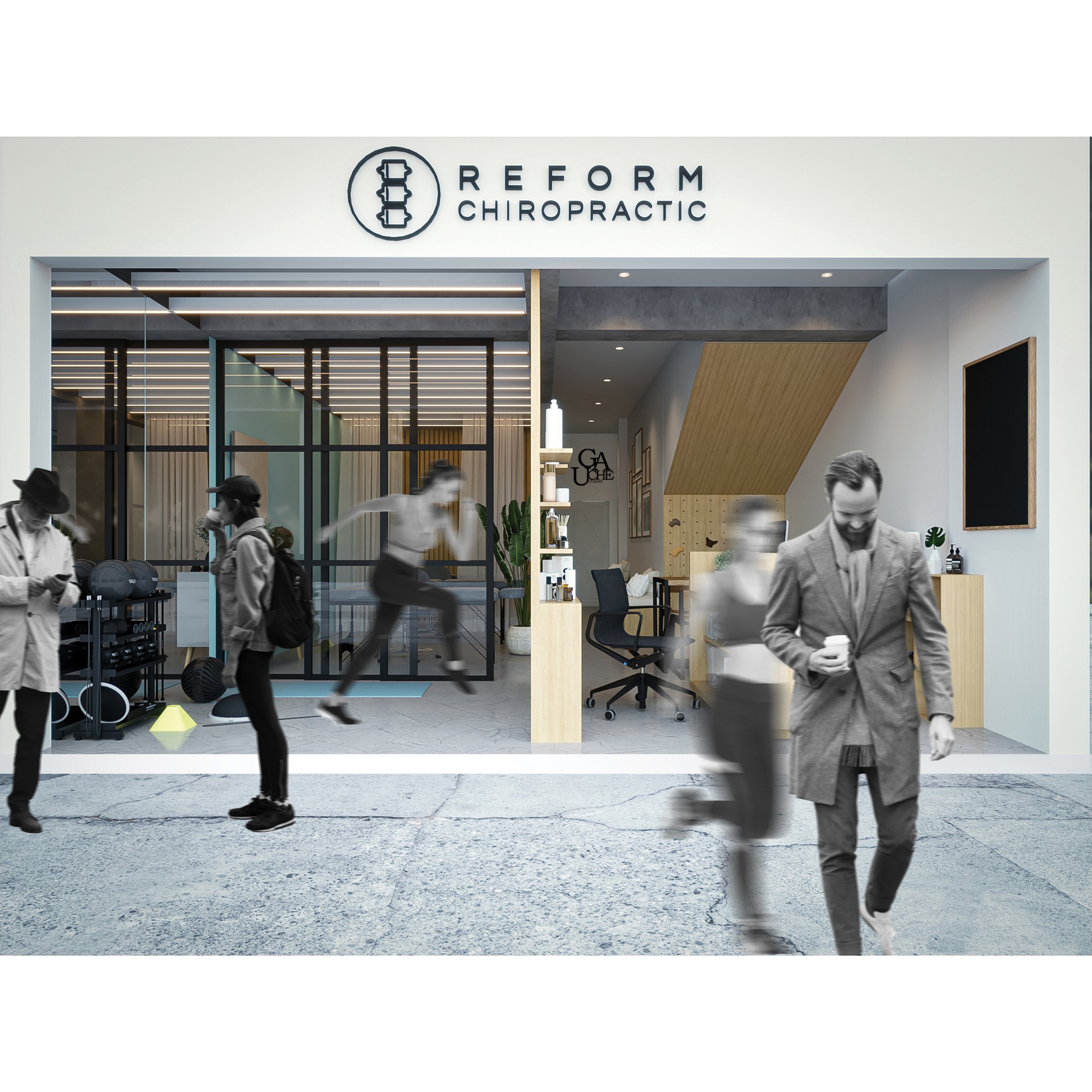
ENTRANCE AND RECEPTION
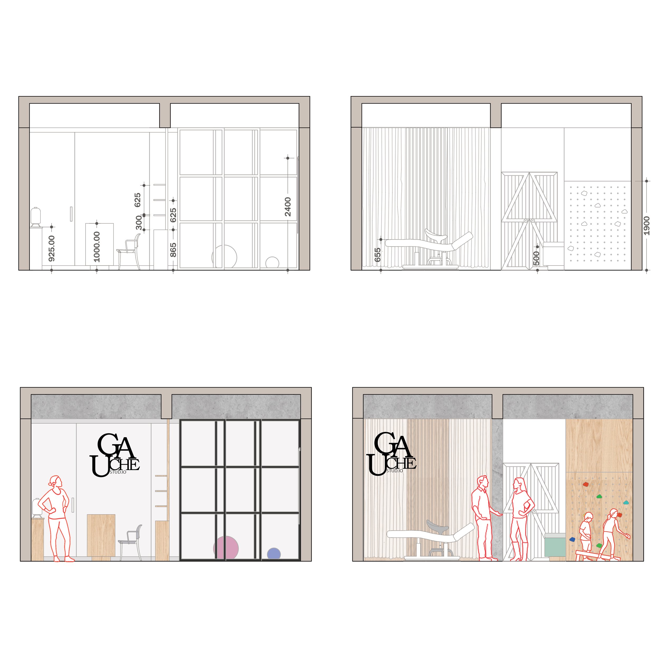
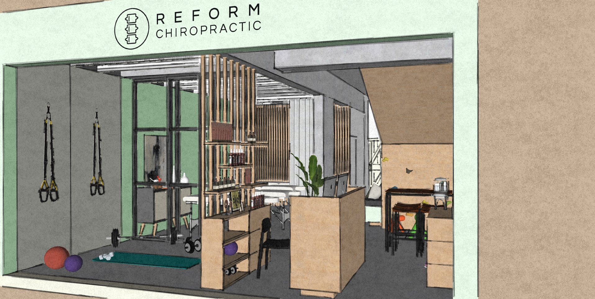
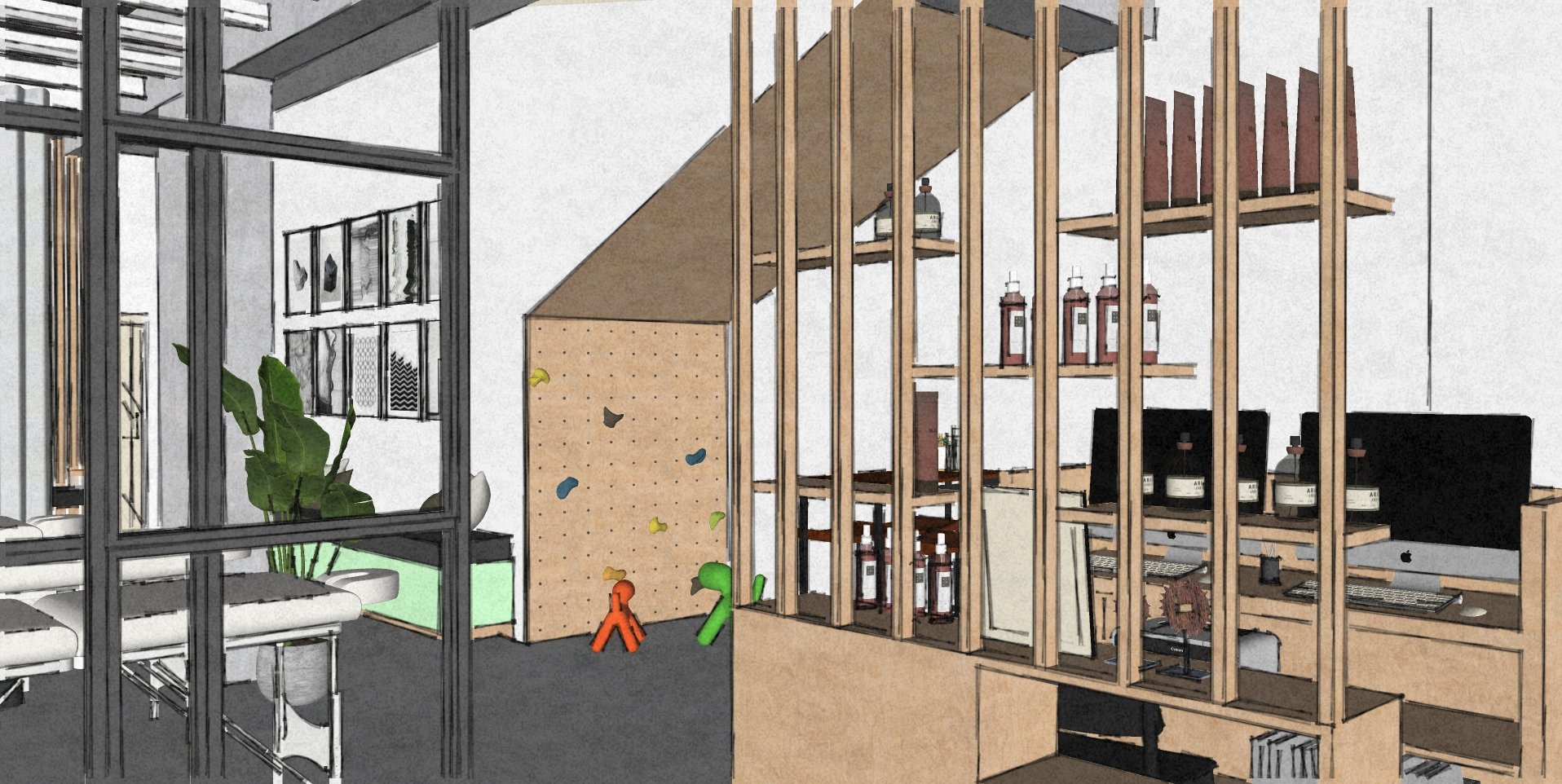
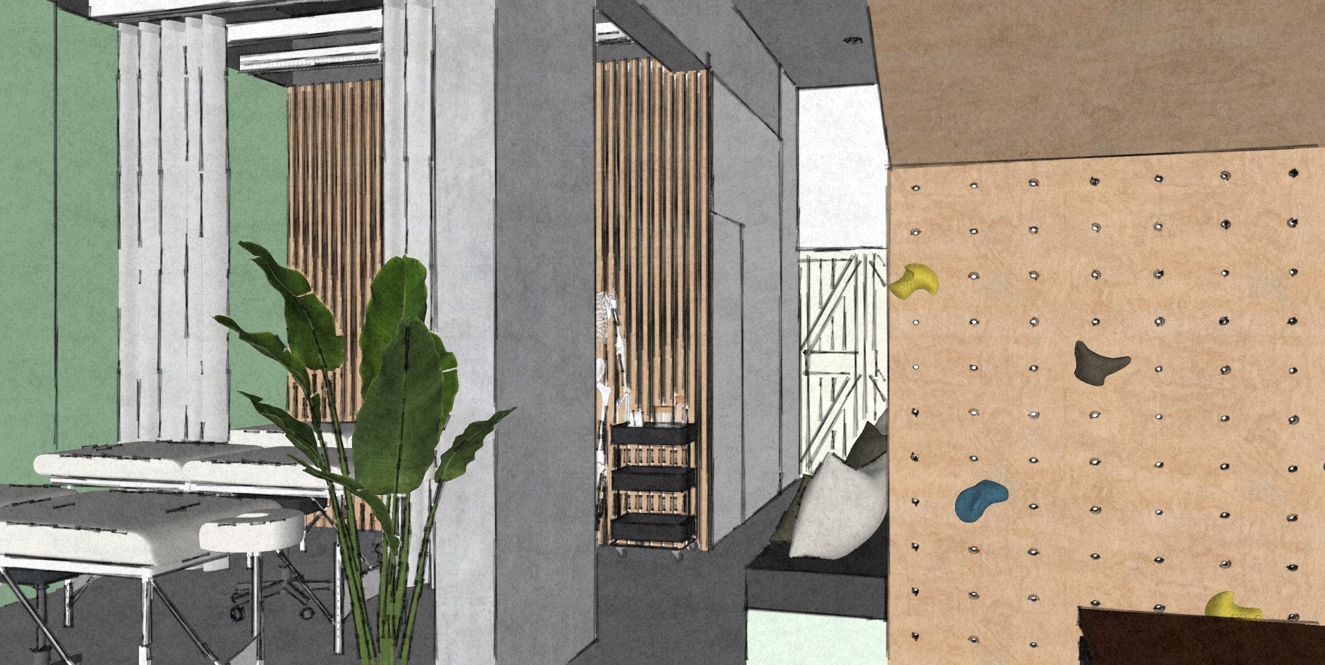
Repositioning the reception desk to the left of the entry door - gives us an opportunity to introduce a toddler entertainment area under the existing staircase. An open-shelf shoe unit with a water dispenser placed on top is seen to the right of the entry door. A small waiting area in the form of a high table with stools was added here - to hold community announcements, offers, and pamphlets. A simple wooden partition with floating retail shelves houses the printer and additional admin supplies. The partition also serves as a visual barrier between the reception and the exercise area.
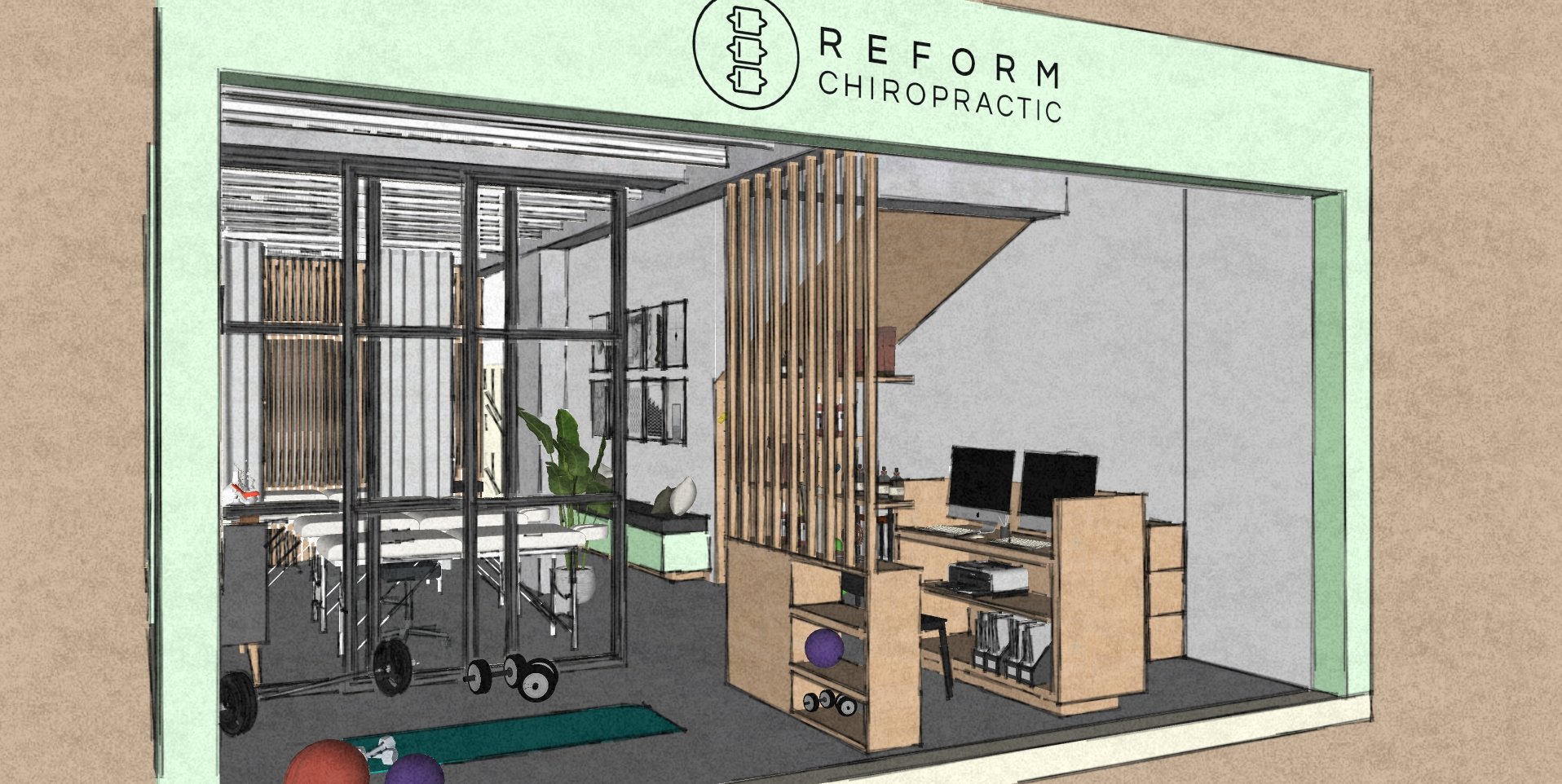
EXERCISE/ MOBILITY AREA
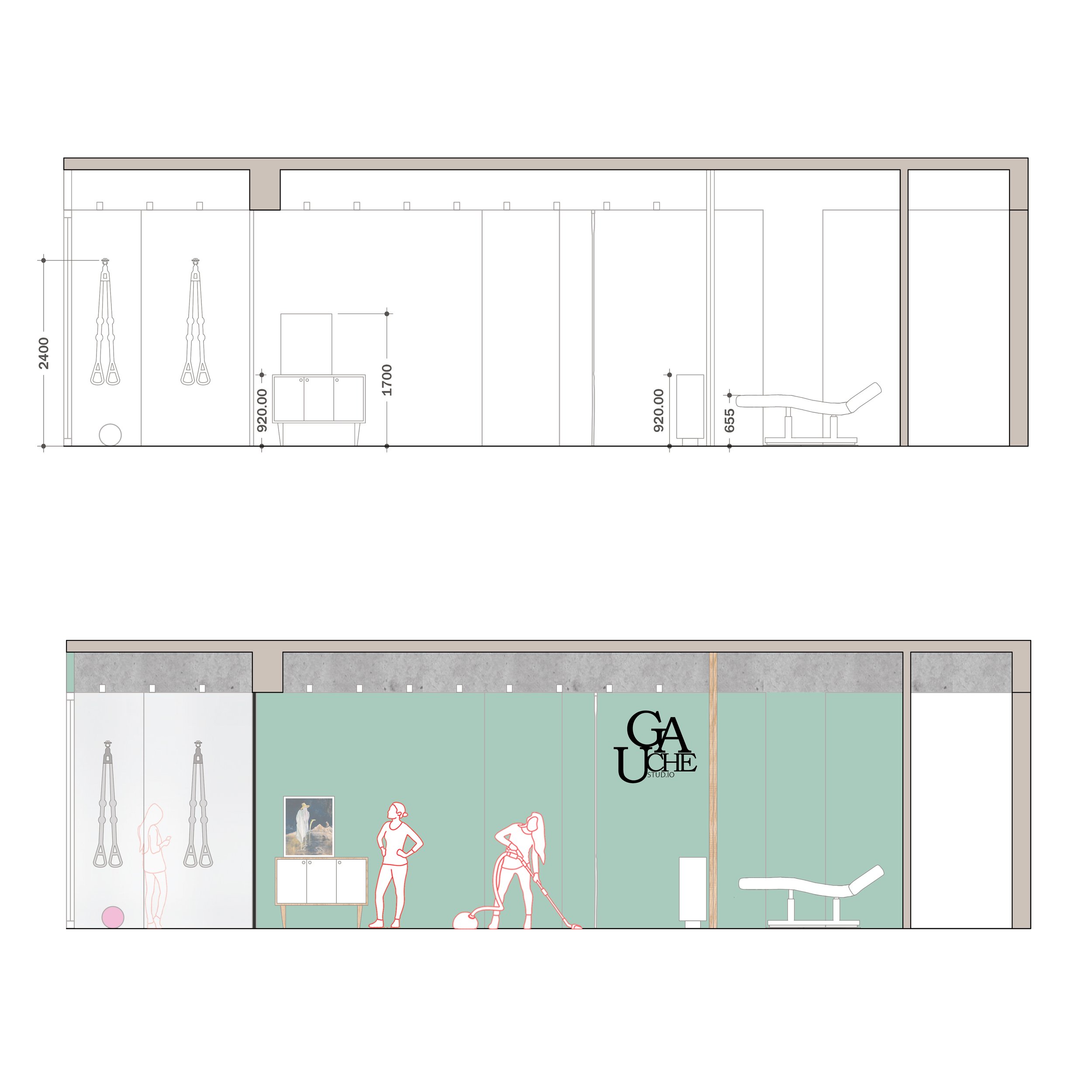
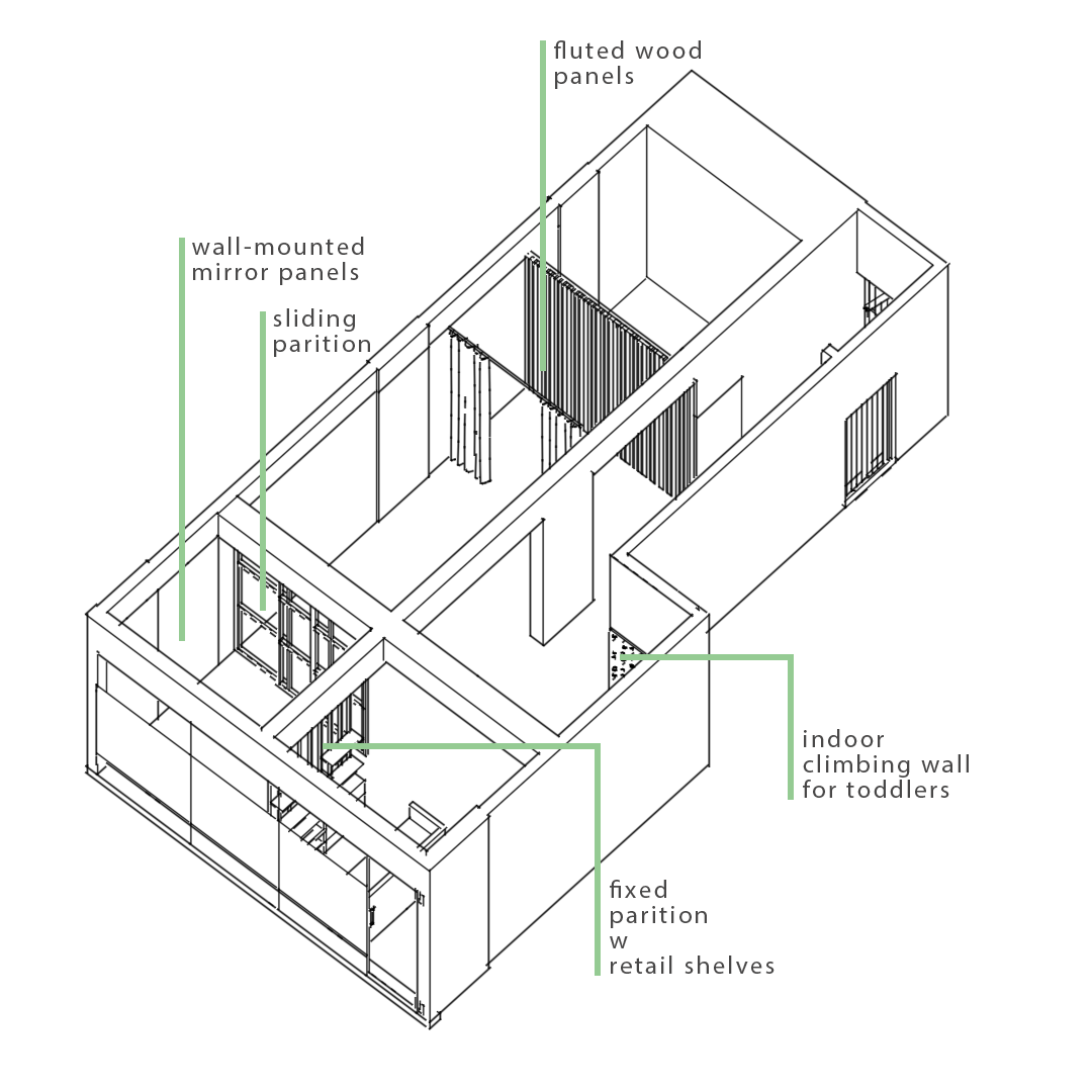
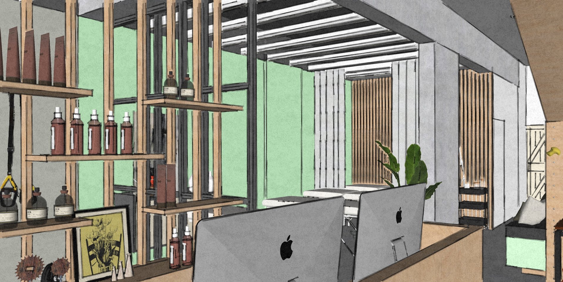
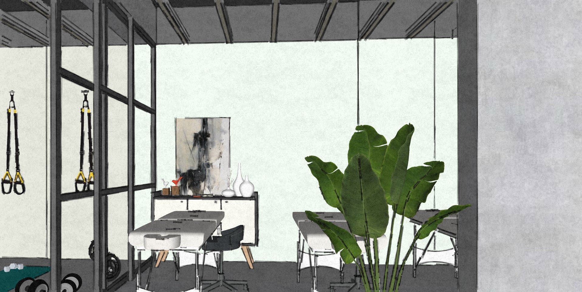
The exercise/ mobility area is flanked by the sliding glass partition, fixed wooden partition, and the storefront. Therefore, in order to make the area appear larger we introduced floor-to-ceiling mirrors. Hooks are proposed to hang equipment such as stretch bands, etc. When needed this area can be included in the common treatment area by stacking the sliding partition panels onto one side. This renders flexibility to the overall clinic, by offering a chance for the expansion of space as and when needed.
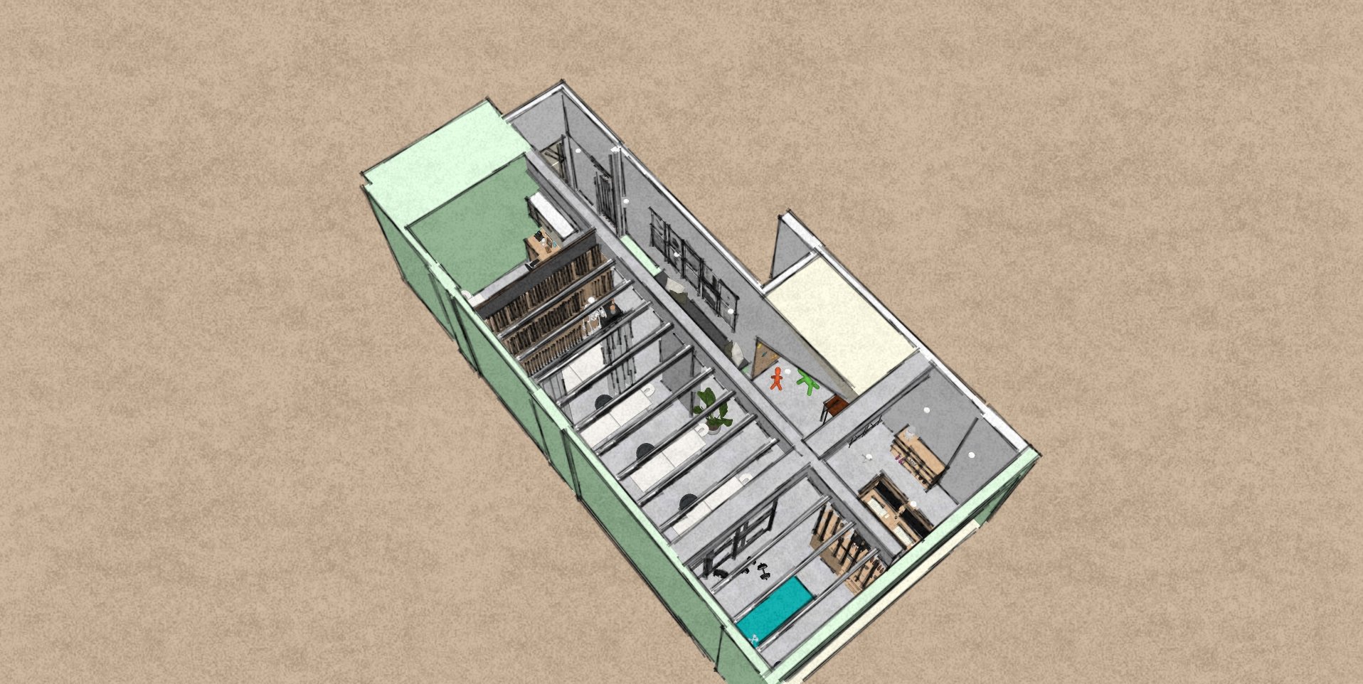

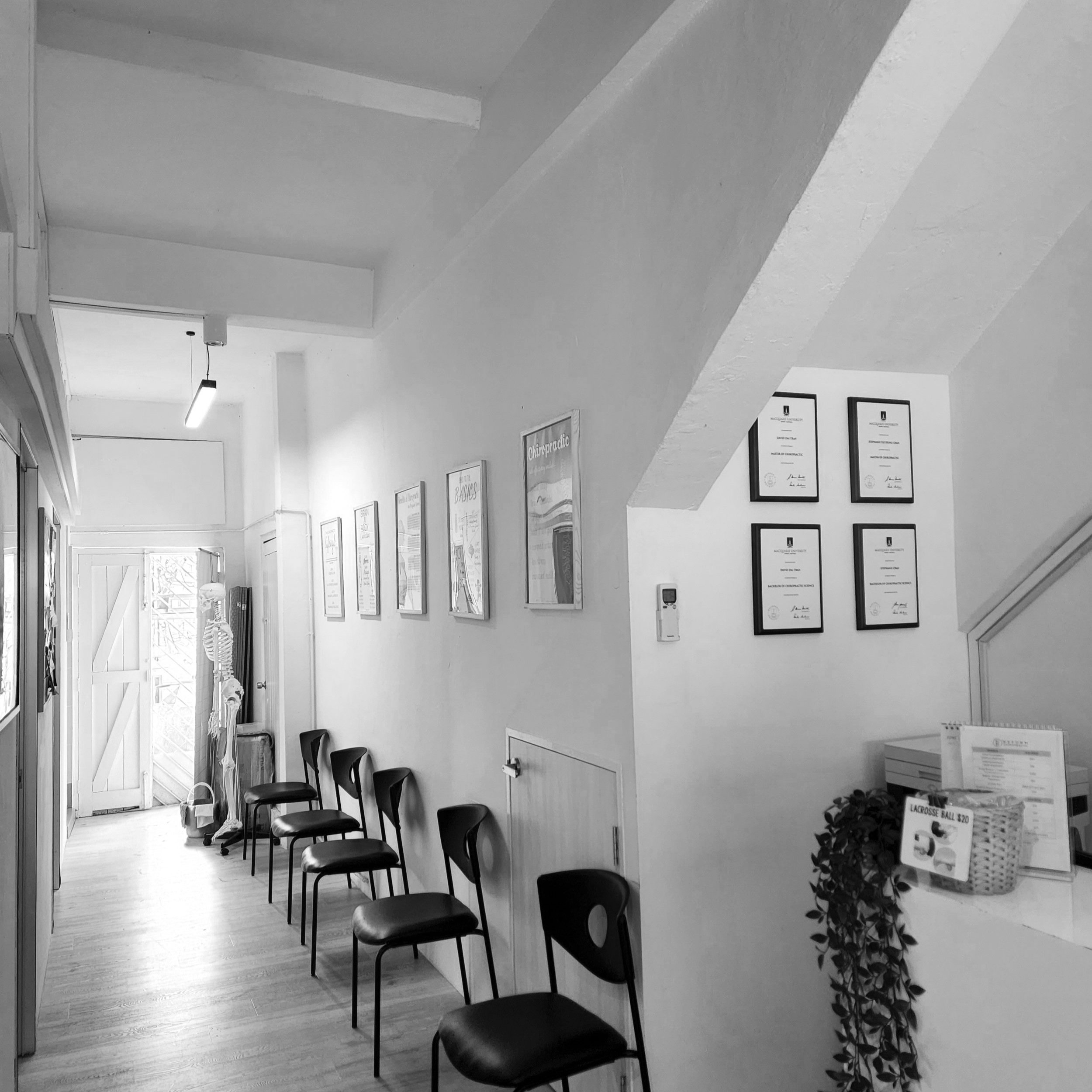
COMMUNITY WAITING AREA
The entrance and reception area spills into a narrow passageway, that leads to the private treatment room at the back. A waiting bench along the passage wall, long enough to accommodate 7-8 people looks onto the common adjustment/ treatment area.
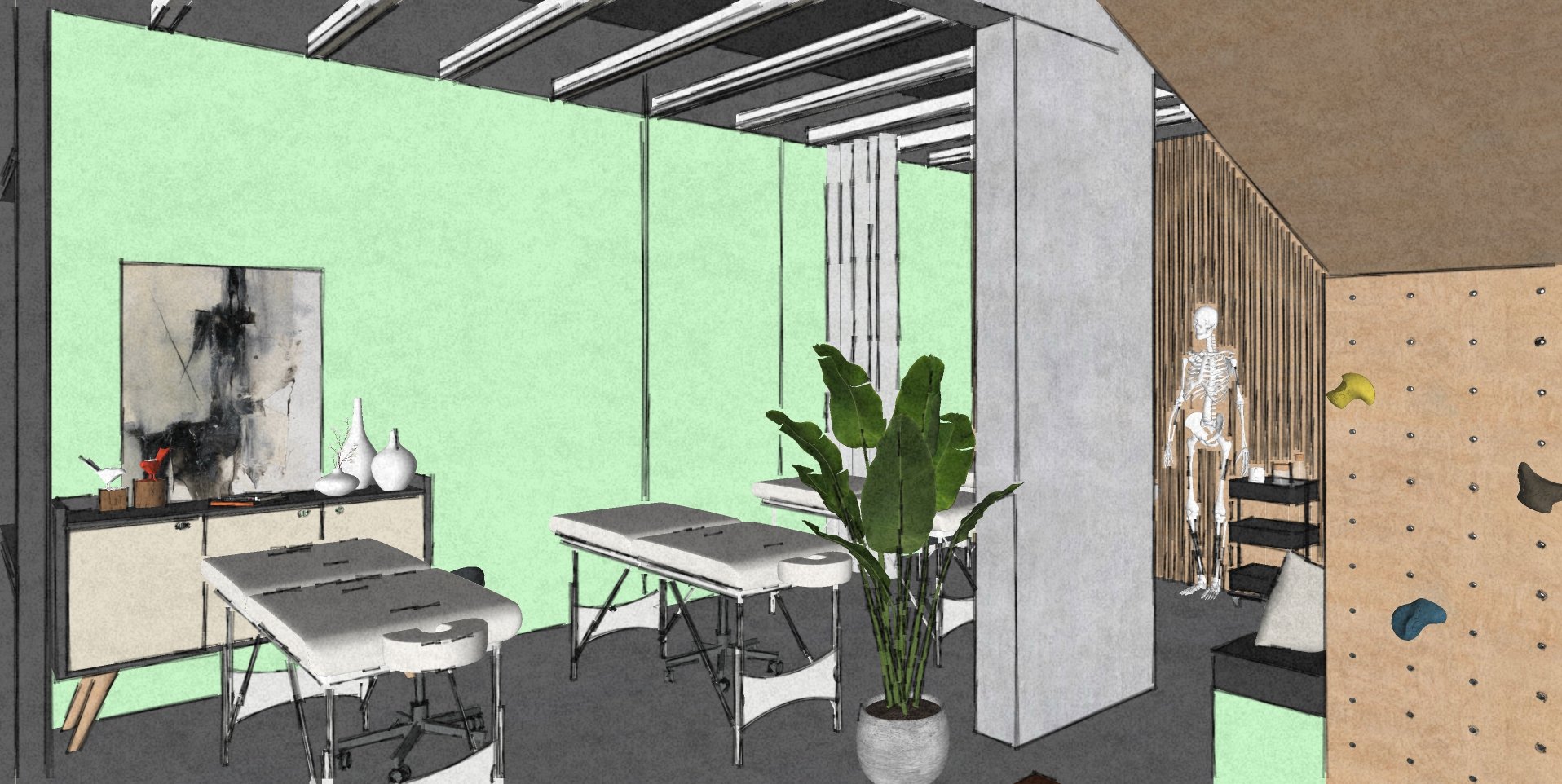
ADJUSTMENT/ TREATMENT AREA
The adjustment/treatment area is divided into two zones: private and common. The most important area is the common adjustment/treatment zone. The heart of the chiropractic clinic is equipped with four adjustment beds, and a couple of consoles for equipment storage. As the client wishes to retain the private treatment room at the very far end of the clinic to keep the options open for private sessions. Additionally, we proposed a curtain for partial privacy to enclose one bed as and when needed.
DESIGN
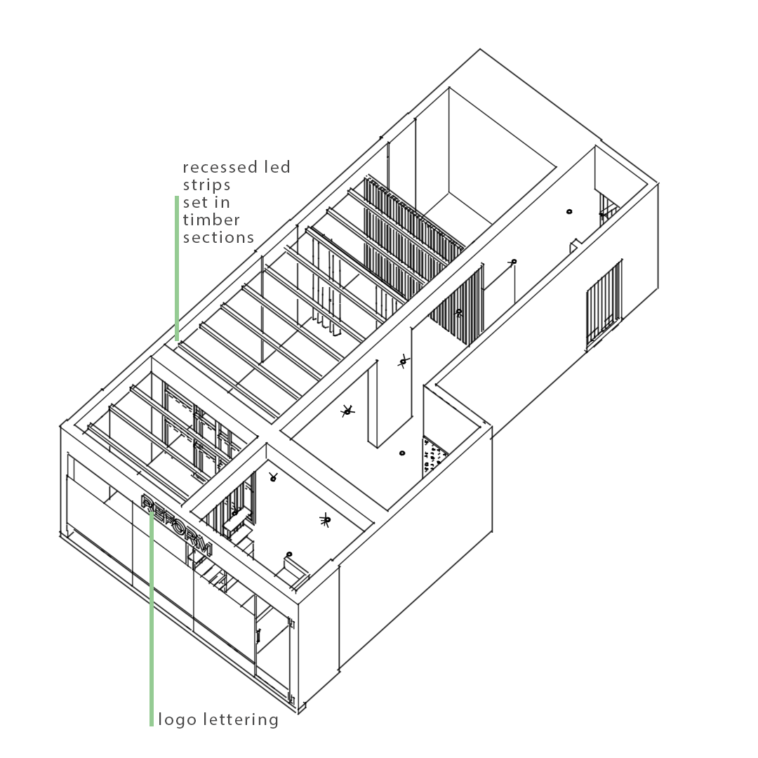
We proposed a fairly simple overall material scheme - white, “reform” green paired with the exposed concrete finish, natural wood, and matte black. The idea is to soothe and not overwhelm the end user. The ceiling detail proposed over the adjustment and mobility area brings these zones into focus. Painting the upper part of the ceiling with anthracite grey further highlights the white rafters’ inset with led strips. Choosing the “reform” green for the wall adjacent to the common treatment area adds to the emphasis. The modern sliding french doors further beg for one’s attention.
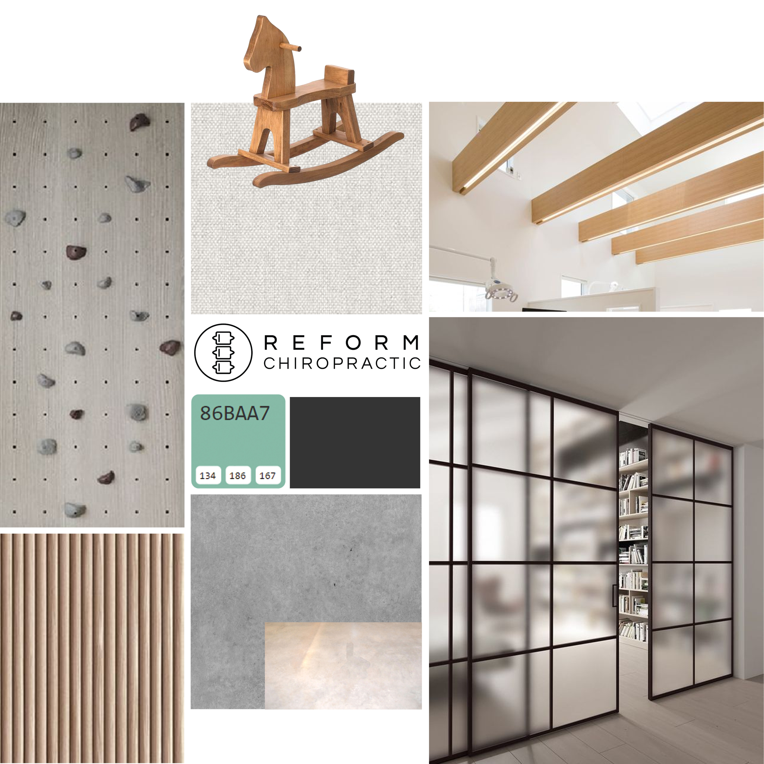
The reception desk and retail shelves are finished in white oak whereas the indoor peg wall is finished in a lighter wood tone, thus providing a contrast. The fluted wall at the far end of the adjustment area is again finished in white oak and is complimented by the wooden slats that double up as posts supporting the retail shelves. We chose to finish the structural beams and columns with a concrete finish to highlight the spatial segregation - the rest of the walls, including the storefront, are proposed as white to brighten the overall look and feel of the chiropractic clinic.
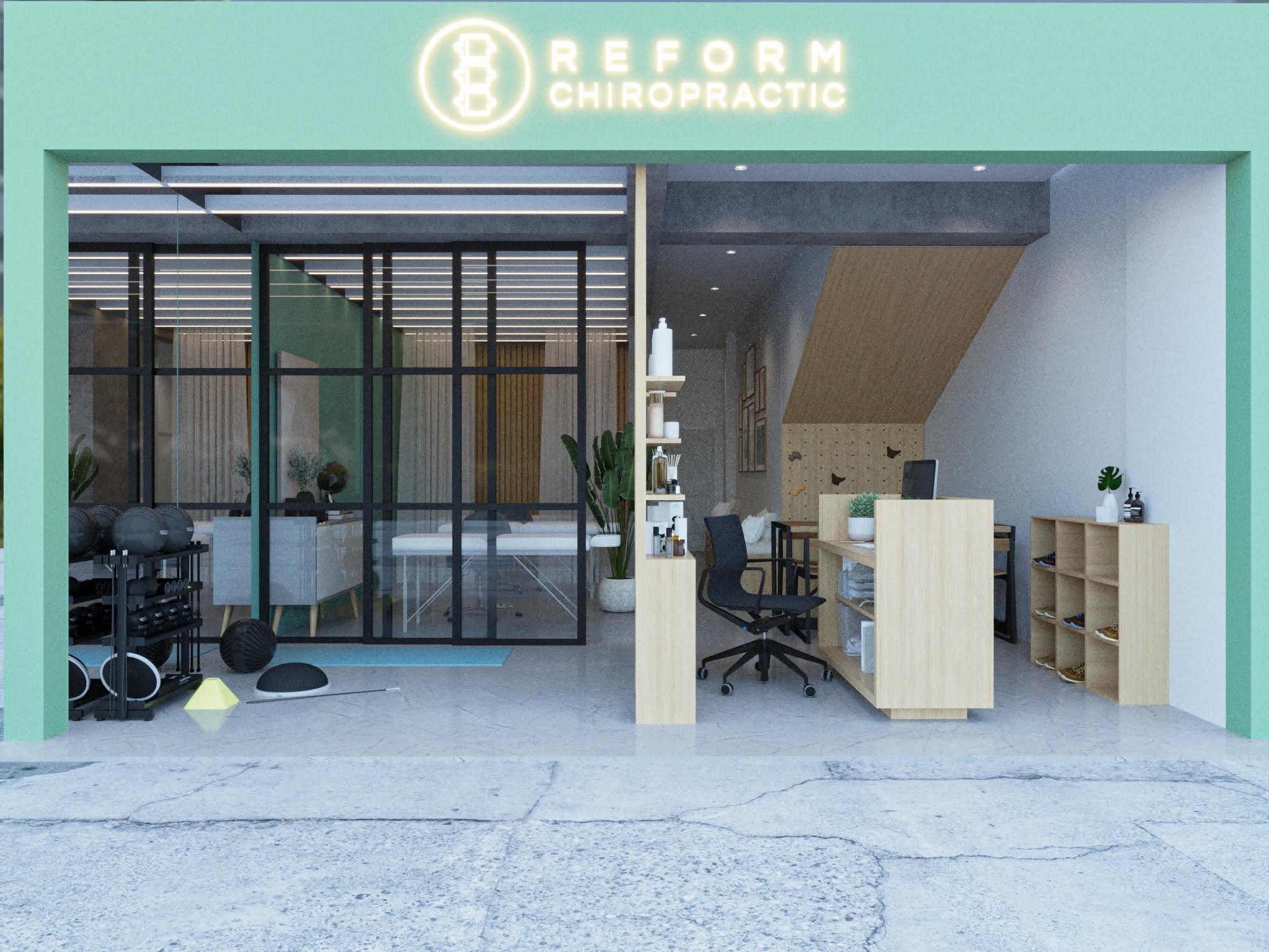
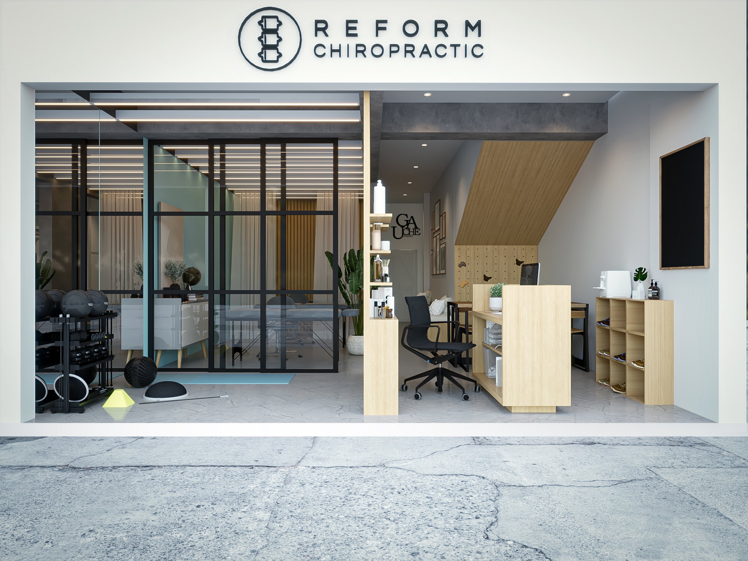
We also attempted an option with a green storefront - however, we liked the white better.
Along with a to-scale 3d model, we developed a final hyper-realistic visual to represent our proposed design+layout for the clinic.
Keeping the same in mind, a drawing set is created to help with on-site execution.
Seen in Elevation A - Exercise/ Mobility Area + Adjustment/ Treatment Area; Seen in Elevation B - Entrance & Reception + Exercise/ Mobility Area;
Seen in Elevation C - Adjustment/ Treatment Area + Entrance & Reception ; Seen in Elevation D - Community Waiting Area + Entrace & Reception.